Understanding Colour Theory in Makeup: The Science Behind Beautiful Looks
Published by Professional Makeup Artist London
Colour theory isn’t just for artists and interior designers—it’s the secret weapon that separates amateur makeup application from professional artistry. Understanding how colours interact, complement, and enhance each other can transform your makeup game from guesswork to precision. This comprehensive guide will unlock the science behind beautiful colour combinations and teach you to make informed choices that enhance your natural beauty.
The Foundation of Colour Theory
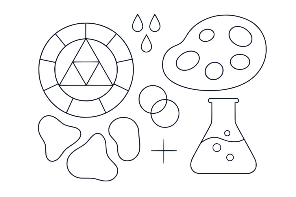
The colour wheel, developed by Sir Isaac Newton in 1666, remains the fundamental tool for understanding colour relationships. This circular diagram organises colours in a logical sequence that reveals their natural harmonies and contrasts. Primary colours include red, the colour of passion and energy, blue, which is cool, calming, and sophisticated, and yellow, which appears bright, cheerful, and attention-grabbing.
Secondary colours are created by mixing primary colours and include orange, formed by combining red and yellow to create a warm and energetic hue, green, made from blue and yellow to produce a natural and balancing colour, and purple, created by mixing red and blue for a luxurious and mysterious tone.
Tertiary colours are created by mixing primary and secondary colours, including red-orange, yellow-orange, yellow-green, blue-green, blue-purple, and red-purple. These provide subtle variations and sophisticated colour options that add depth and complexity to makeup looks.
Understanding this foundation helps you make informed decisions about makeup product selection and colour combinations that work harmoniously together.
Understanding Undertones: The Key to Flattering Makeup
Undertones are the subtle hues beneath your skin’s surface that remain constant regardless of tanning, blushing, or other temporary colour changes. Identifying your undertones is crucial for selecting flattering makeup colours that enhance rather than clash with your natural colouring.
Cool undertones are characterised by pink, red, or blue undertones beneath the skin’s surface. People with cool undertones typically have veins that appear blue or purple, find that silver jewellery looks more flattering than gold, and tend to burn easily whilst tanning with difficulty. These individuals look best in colours with blue or pink bases.
Warm undertones feature yellow, golden, or peachy undertones beneath the skin. Those with warm undertones usually have veins that appear green or olive, find gold jewellery more flattering than silver, and tan easily whilst rarely burning. Warm-toned individuals are enhanced by colours with yellow or orange bases.
Neutral undertones represent a balanced mix of cool and warm characteristics. People with neutral undertones typically have veins that appear blue-green, find both gold and silver jewellery flattering, and have moderate tanning ability. These fortunate individuals can wear both cool and warm colours successfully.
Colour Harmony in Makeup Application
Complementary colours sit opposite each other on the colour wheel and create the highest contrast and visual impact when used together. Classic complementary pairs include red and green, perfect for holiday looks or dramatic contrast, blue and orange, ideal for making blue eyes pop with vibrancy, and purple and yellow, which creates sophisticated, unexpected combinations that are both striking and elegant.
In makeup applications, complementary colours can be used to make eye colour more vibrant by applying the opposite colour on the wheel, create cohesive looks by applying complementary blusher and eyeshadow, and achieve dramatic contrast for special occasions when you want maximum impact.
Analogous colours are adjacent on the colour wheel and create harmonious, pleasing combinations that feel natural and effortless. Popular analogous schemes include red, red-orange, and orange, perfect for warm, sunset-inspired looks that evoke golden hour lighting, blue, blue-green, and green, which creates cool, oceanic themes reminiscent of tropical waters, and purple, red-purple, and red, ideal for romantic, feminine looks with depth and sophistication.
Colour Correction: The Science of Neutralisation
Colour correction uses the principle that complementary colours neutralise each other. By applying the opposite colour on the wheel, you can cancel out unwanted tones and create a more even, balanced complexion.
Green corrector neutralises red tones such as rosacea, blemishes, and irritation. It should be applied in a light layer before foundation and works best for those with persistent redness that shows through regular foundation coverage.
Purple or lavender corrector neutralises yellow tones including sallowness and dark circles. It’s typically applied to the under-eye area and dull spots and works best for fair to medium skin tones where yellow discolouration is prominent.
Peach or orange corrector neutralises blue and purple tones such as dark circles and bruises. It’s particularly effective when applied to the under-eye area on deeper skin tones where blue and purple discolouration is more common.
Advanced colour correction techniques involve layering correctors by applying them before foundation for natural coverage, using proper brush techniques for seamless blending, and setting with translucent powder before foundation application to prevent the corrector from moving or mixing with foundation.
Eye Colour Enhancement Through Colour Theory
Brown eyes are incredibly versatile and can wear almost any colour, but certain shades create particularly stunning effects. The complementary approach uses blue tones such as navy, cobalt, and royal blue to create striking contrast, purple shades including plum, violet, and lavender to enhance golden flecks naturally present in brown eyes, and green hues like emerald and forest green to add depth and richness.
Blue eyes benefit from warm tones that create beautiful contrast and make the blue appear more vibrant and striking. Optimal colour choices include the orange family with peach, coral, and burnt orange creating stunning contrast, warm browns such as bronze, copper, and golden brown that enhance without competing, and warm purples like plum and burgundy with warm undertones that complement rather than clash.
Green eyes are enhanced by colours that either complement or harmonise with their natural hue. Complementary reds include burgundy and wine for dramatic, sophisticated looks, warm browns with red undertones that enhance natural green whilst adding depth, and coral and peach as softer options for everyday wear that still provide enhancement.
Hazel eyes contain multiple colours and can be enhanced to emphasise different aspects depending on the desired effect. To emphasise green in hazel eyes, use warm reds and burgundies, apply golden and bronze tones, and choose warm purples and plums. To emphasise brown in hazel eyes, select blue and purple tones, use cool greens and teals, and apply silver and grey shades.
Professional Colour Selection and Application
Building a versatile colour palette requires strategic selection of essential neutrals that complement your undertones, including both warm and cool options for versatility, and investing in quality neutral shades for daily use since these will be your most-used colours.
Colour coordination strategies include the sixty-thirty-ten rule, using sixty percent neutral base colours, thirty percent secondary harmonious colours, and ten percent accent or pop colours. Monochromatic sophistication involves using varying shades of the same colour family, creating depth through value changes, and achieving looks perfect for professional or elegant occasions.
Understanding makeup’s historical context helps modern makeup artists appreciate how colour choices have always been deeply cultural and symbolic, informing contemporary colour selection with traditional wisdom.
Conclusion
Understanding colour theory transforms makeup application from trial and error to informed artistry. By mastering the relationships between colours, identifying your unique undertones, and applying scientific principles to your beauty routine, you can create looks that truly enhance your natural features.
Remember that colour theory provides guidelines, not rigid rules. The most important factor is how colours make you feel and how confident they make you appear. Use this knowledge as a foundation, but don’t be afraid to experiment and develop your personal style.
Whether you’re creating a natural everyday look or a dramatic evening transformation, colour theory gives you the tools to make informed decisions that result in beautiful, harmonious makeup. Combined with proper application techniques and quality tools, this knowledge will elevate your makeup artistry to professional levels.
Ready to apply colour theory to your personal makeup routine? Book a professional colour consultation to discover your perfect palette and learn personalised colour techniques.
